Apple · ATLAS · 2018–2019

ATLAS

A clearer learning experience and a design system built to scale globally.

Years of additions made ATLAS harder to navigate. I redesigned how employees find relevant training and continue learning, with a shared system that could work across more than 50 markets.

+69%Reported increase in course completion.

My contribution

I connected information architecture, personalization, and a reusable design system across more than 50 markets.

01 / A clearer starting point

Make the next learning step obvious.

I reorganized the home around current priorities, unfinished courses, and relevant recommendations. Employees could continue learning without navigating the full catalog first.

A personal learning homeClear paths and current priorities give people a useful place to begin.
Restructured coursesRestructured courses organize learning around the time and attention available on the retail floor.
Explore the details
1 / 4
Personalization in practiceProgress, achievements, and recommendations respond to the individual, connecting completed learning with what comes next.
Navigation and the homePriorities, recommendations, and continued learning brought into one scannable starting point.
Discovery across marketsSearch and browse patterns for a global learning catalog.
Learning in contextCourse and module flows shaped around how retail teams actually learn.
02 / A scalable foundation

Make clarity repeatable.

I translated the experience into shared components, themes, density rules, and icons so new features could grow from a consistent foundation.

Accessibility and localizationDesktop patterns designed to support employees across markets.
The ATLAS Design SystemShared components, tokens, themes, density controls, and icons support the evolution of ATLAS across features and markets.
03 / Research and iteration

Connect employee needs to interface details.

Usability research with retail employees and learning partners helped distinguish recurring needs from the platform’s accumulated features.
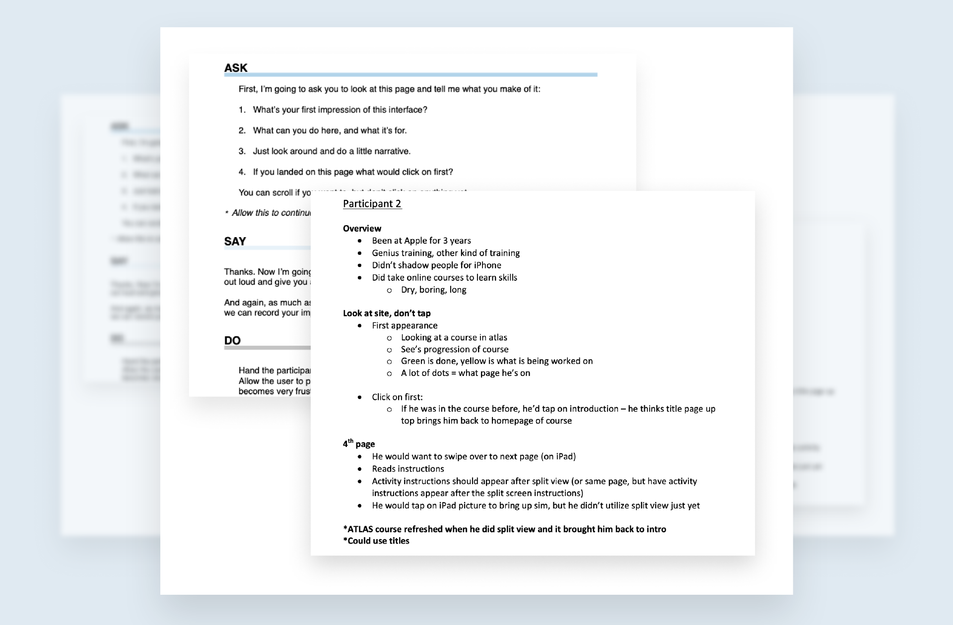
Usability research
Usability researchInterview scripts and participant notes from employees using the legacy platform.
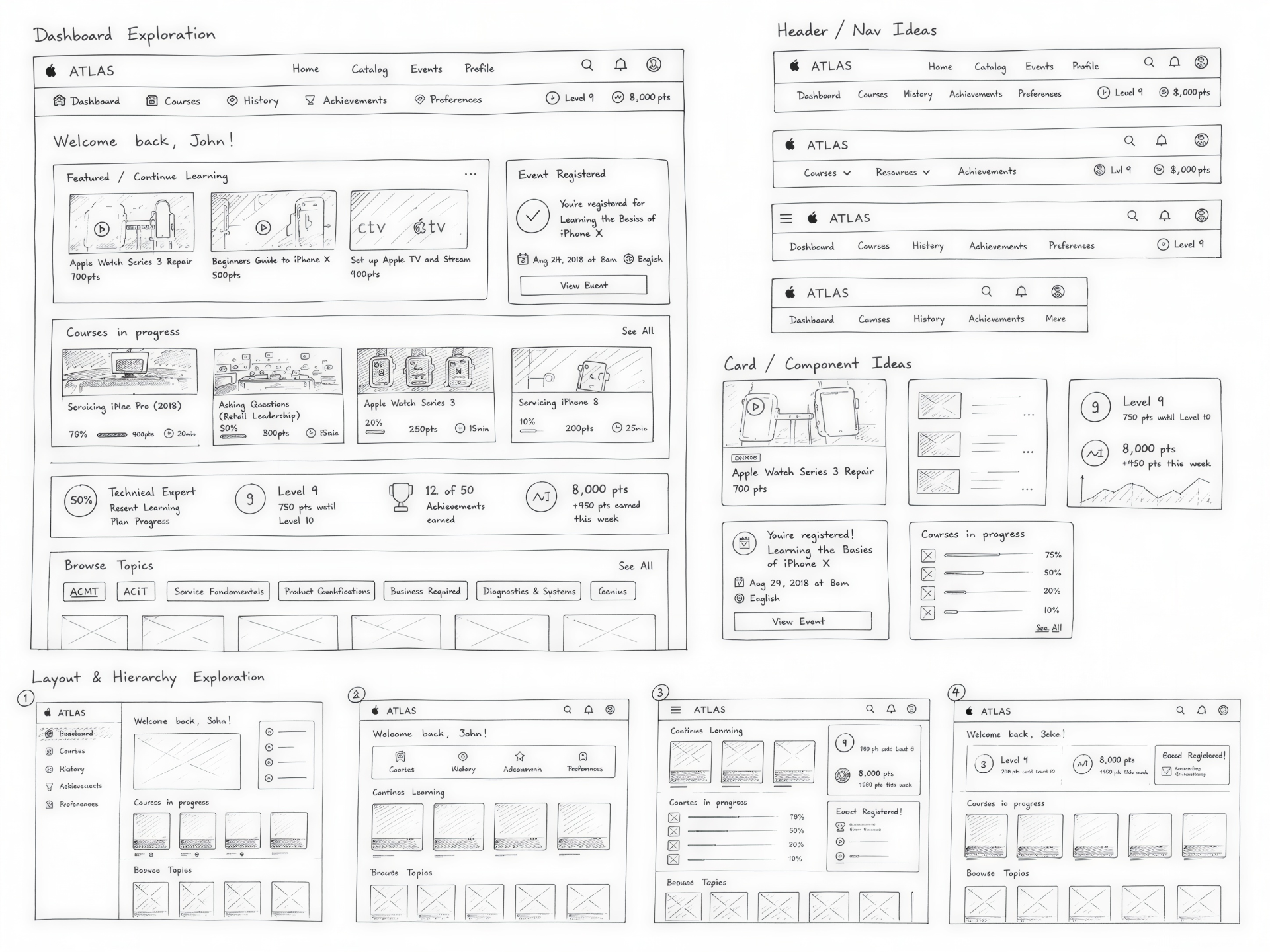
Hierarchy on paper
Hierarchy on paperDashboard, header, and card explorations before committing to the interface.
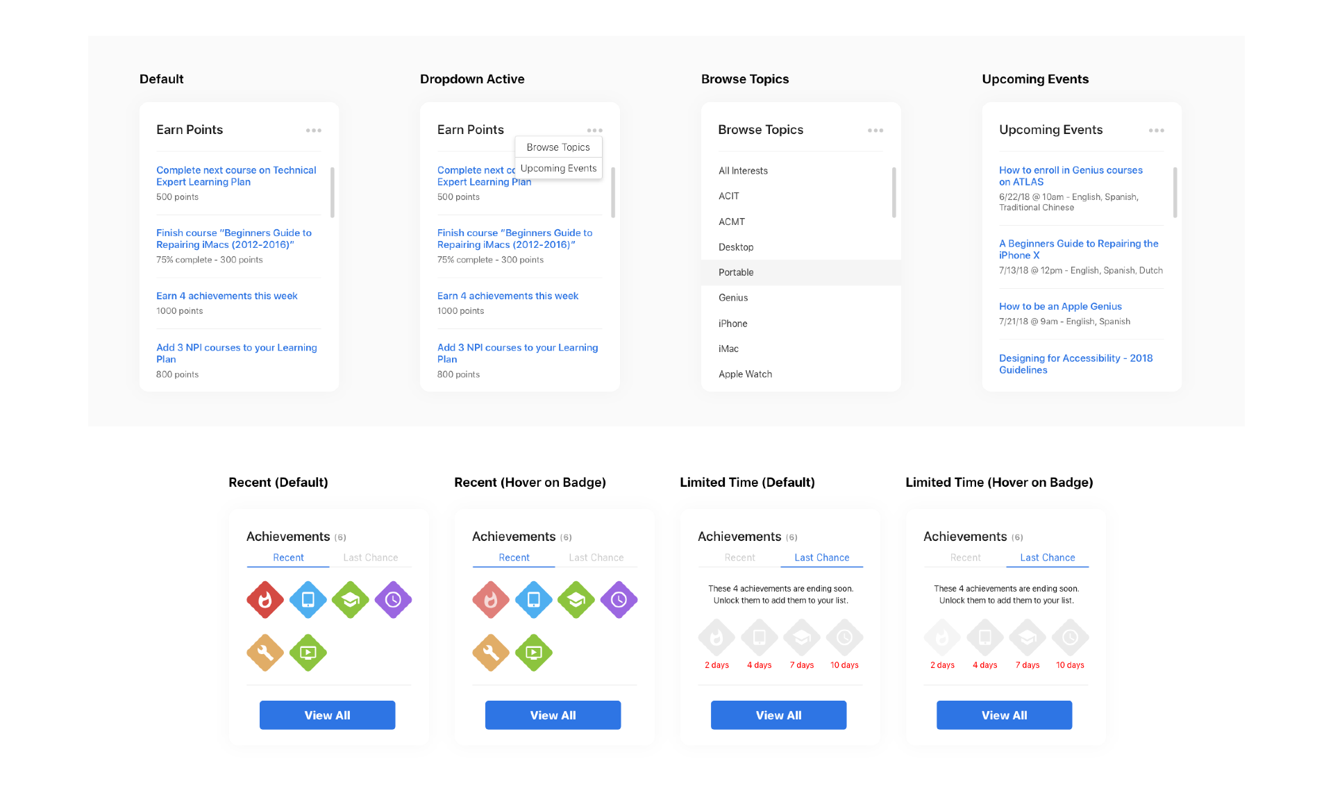
Personalization states
Personalization statesPoints, topics, upcoming events, and achievements considered across default and hover states.
The impact

Learning that reached more people.

The redesign paired a clearer learning experience with reusable components, accessibility, and localization. That foundation supported the platform across more than 50 markets.

Course completion
+69%
Reported project increase.
People in the first week
474,000+
Reported initial usage.
Markets supported
50+
Through shared design patterns.
Beyond desktop

Learning in smaller moments.

These iPhone and Apple Watch concepts explore quick answers, prompts, and reminders outside the full desktop experience. They are explorations of the platform’s hierarchy across new surfaces.

Knowledge in the momentAn iPhone concept for finding a useful answer when it is needed.
Mobile learning conceptAn exploratory mobile concept applying the platform’s hierarchy, typography, and controls to learning in the moment.
Learning on the wristA companion concept with glanceable prompts and reminders.
Watch interaction studyExploring the smaller learning moments a companion surface could support.

Next project

Story Hub

AI tools for developing a story

A workspace that connects screenplays, source evidence, and AI-generated creative material.

Explore the case study